
ARTICLE BODY EDITOR
TOOLBAR
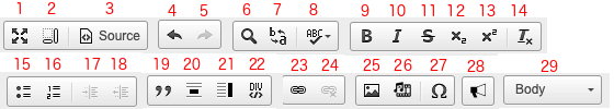
- Views (1-3)
- Undo/Redo (4 & 5)
- Text Check (6-8)
- Text Formatting (9-14)
- Lists (15-18)
- Block Formatting (19-22)
- Linking (23 & 24)
- Multimedia (25-27)
- Advertisements (28)
- Elements (29)
VIEWS
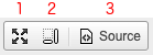
- Maximize – Fills the screen with the body editor, hiding the other sections of the article editor
- Show Element Blocks – This will show you the block each piece of content is set as
- Source – This will show you the article in HTML format
UNDO/REDO

4. Undo – Undo last edit
5. Redo – Redo last deletion
TEXT CHECK
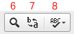
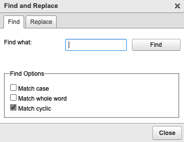
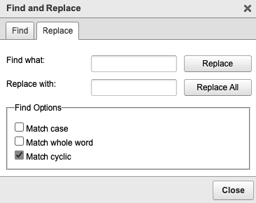
6 & 7. Find and Replace – Opens the find window to search the current article contents, you can also replace matching content.
8. Spell Check – Check the spelling of your article

NOTE: Enable SCAYT (SpellCheck As You Type) if you would like to see spelling errors while typing.
TEXT FORMATTING
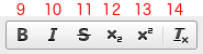
9. Bold – Make text bold, uses html <b> tag
10. Italic – Makes text italic, uses html <i> tag
11. Strikethrough – Adds a strikethrough to text, uses html <s> tag
12. Subscript – Makes selected text subscript, uses html <sub> tag
13. Superscript – Makes selected text superscript, uses html <sup> tag
14. Remove Formatting – Removes all formatting from selected text
LISTS
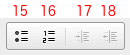
15. Insert Bulleted List – Inserts bulleted list, uses html <ul> tag
16. Insert Numbered List – Inserts numbered list, uses html <ol> tag
17. Increase Indent – Increases indent, works only when in a list (numbered or bulleted)
18. Decrease Indent – Decreases indent, works only when in a list (numbered or bulleted)
BLOCK FORMATTING
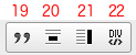
19. Block Quote – Applies block quote formatting to selected text
20. Pull Quote – Applies pull quote formatting to selected text
21. Sidebar – Applies sidebar formatting to selected text
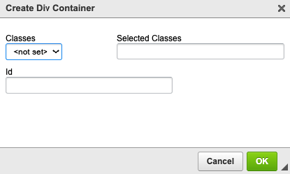
22. Create DIV Container – Allows you to create your own div container with predefined classes and/or a custom ID
LINKING

23. Insert link – Add a link to selected text or add a URL, uses html href. Opens a link properties window with 4 tabs:
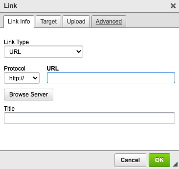
Link Info
- Link Type – choose from URL, E-mail or Link to anchor in the text
- Protocol – beginning of the full URL
- NOTE: This field will automatically select the correct protocol when pasting in the full URL in the URL field.
- URL – type/paste the URL you want to link to
- Browse Server – link to an item within the document, typically images
- Title – this will show as the mouseover text on the link
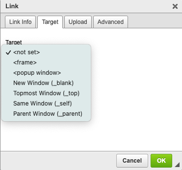
Target
- <not set> – Defaults to browser behavior
- <frame> – Opens the link within a named iframe, must enter the Target Frame Name
- <popup window> – Opens the link in a popup window, must enter popup window variables: window name, height, width, etc.
- New Window – Opens the link in a new window, equal to target=”_blank”
- Topmost Window – Opens the link in the main window of the user’s browser, equal to target=”_top”
- Same Window – Opens the link in the same window, equal to target=”_self”
- Parent Window – Opens the link in the parent window, equal to target=”_parent”

Upload
You can upload a file to be the target of the link, such as an image, PDF or document.

Advanced
- Id – An id on an <a> (anchor) tag assigns an identifier to the link. The identifier must be unique across the page. Source
- Name – Creates an anchor on your page that another <a> tag can link to. Anchor Tag Example:
<a href="#bottom">Link to the bottom of the page</a>
<a name="bottom" id="bottom">This is the target link at the bottom of the page</a>
- Language Direction – Sets the base direction of text for display. If the overall document direction is right-to-left, add dir=”rtl” to the html tag. Only use the dir attribute on the rare occasions when the base direction needs to change in order for the text to display correctly. Source
- Language Code – Indicates the language of a link destination. Source
- Access Key – Provides a hint for generating a keyboard shortcut. The attribute value must consist of a single printable character (which includes accented and other characters that can be generated by the keyboard). Source
- Tab Index – Indicates that the link element can be focused, and where it participates in sequential keyboard navigation (usually with the Tab key, hence the name). Source
- Advisory Title – The title contains text representing advisory information related to the element it belongs to.
- Advisory Content Type – The type attribute specifies the Internet media type (formerly known as MIME type) of the linked document. Source
- Stylesheet Classes – Applies a class to the <a> element. Source
- Linked Resource Charset – Specifies the character encoding of the resource designated by the link. Source
- Relationship – Conveys relationship information that may be rendered by user agents in a variety of ways (e.g., a tool-bar with a drop-down menu of links). Source
- Style – Applies an inline style to the <a> element.
24. Remove Link – Deletes the selected link
MULTIMEDIA
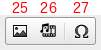
25. Add/Edit Image – If no image is selected, you will be prompted to add a new image. If an image is selected, the Image Properties window will appear for that image. You can also open the Image Properties window for an existing image by double-clicking on the image. The Image Properties window has 3 tabs:
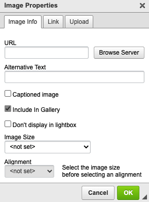
Image Info
- URL – The URL of the image
- You can also Browse Server to place an already existing image
- Alternative text – A brief description of the image which will show instead of the image if needed. Also used for readers using a screen reader.
- Captioned Image – Add a caption to your image
- Include in Gallery – This setting is checked off by default and is used along with the Gallery Template.
- Don’t display in lightbox – This setting will disable the lightbox feature for the selected image.
- Image Size – Set the percentage of the width of the image in comparison with the width of the screen.
- Alignment – Once the Image Size is selected, you have the ability to align the image left, center or right. Aligning left or right will style the text under the image to wrap.
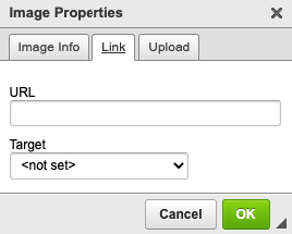
Link
- URL – Add a URL for your image to link to.
- Target – Set the window the link opens to
- New Window – Opens the link in a new window, equal to target=”_blank”
- Topmost Window – Opens the link in the main window of the user’s browser, equal to target=”_top”
- Same Window – Opens the link in the same window, equal to target=”_self”
- Parent Window – Opens the link in the parent window, equal to target=”_parent”
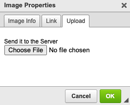
Image Upload
Choose the file of the new image you would like to place.
Moving images – You can move an image and its caption by dragging on the crosshairs icon that appears at the top left corner of an image.
26. Embed Media – Use this dialog to embed external content in your article like videos hosted on 3rd party servers. Look for an option like “Embed” or “Embed Code” on the item that you want to insert, then copy and paste the provided HTML below.
You can also embed iFrames, HTML5 Video or HTML5 Audio. If your embed code does not include values for width and height, you must enter them in the Width and Height fields below. These are used as a guideline to maintain the correct shape when resizing your embedded content.
NOTE: Important in order to be WCAG compliant, all iframe tags must have a title tag. If your embed code does not include this, you can add it with the tag below.
title="insert title name here"

27. Insert Special Character – Choose from a list of special characters, which will be converted in the source to their associated HTML entity.

ADVERTISEMENTS

28. Fractional Advertisements – Allows users to insert an advertisement. See Self-Serve Fractional Ad Placement.
ELEMENTS
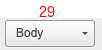
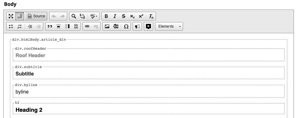
29. Content Elements – There are a number of predefined classes that you can use to affect the way your content is structured. The appearance of each of these elements is defined during the initial customization process. Use the Elements menu to change the class of selected text.
Block elements – Block elements will apply to the entire block of content, i.e. paragraph, when you apply them, regardless of what text is selected.
- Body – Use for the main text of the article. This is the default style.
- Roof Header – The roof header (sometimes called the section header) appears at the top of the first page of the article. Typically the roof header is used to label recurring columns or sections within your document. You can only have one roof header per article.
- Subtitle – The subtitle (sometimes called the deck) appears below the article title.
- Byline – The byline appears below the article title, after the subtitle.
- Headings 2, 3, 4 – Use for headings within the body of an article.
- NOTE: Heading 1 is used for the Title of each article.
- Supplementary – Use supplementary for short additional content at the end of an article, such as an author bio.
Inline elements – Inline elements apply only to the selected text.
- Attribution – Use to identify the author at the end of an article or for the photo credit in a caption.
- Drop Cap – Use to mark a single letter at the beginning of a paragraph as a drop cap.
 Contact Support